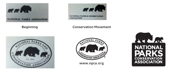
NPCA’s visual personality has evolved dramatically over the last few years, but our logo hasn’t changed significantly in half a century. It was long overdue for an update. After about a year and a half of research, focus-group testing, surveys, and outreach, NPCA finally unveiled a modernized logo yesterday.
Why change?
Our previous logo served us well for almost fifty years, but had come to look dated and traditional. My goal was to create something clear, clean, memorable, and, most importantly, readable across all media—from Twitter and Facebook to publications and event invitations.
Our intent was to make the change be an evolution, not a revolution. Hesitation to change is natural, but times change and so do logos. You might be surprised to see the earlier marks of some well-known brands.
Why now?
With the redesign of our website, an updated magazine design, and other updates to NPCA’s brand, now is the perfect opportunity. The launch of our brand-new blog and other digital renovations is the ideal time to make the switch.
Why keep the bears?
People suggested all kinds of icons to replace the bears in our logo–everything from bees to trees. I conducted thorough research of park symbols, talked to numerous long-time staff members, and sketched dozens of options. In the end, research showed it was clear the symbol of the bear was meant to stay, for a few good reasons:
- The bears have been the symbol of NPCA for decades.
- The bears represent our first park, Yellowstone.
- In American Indian legends, the bear represents strength and greatness on Earth.
- The bear is a common charge in heraldry, interpreted as symbolizing strength, cunning, and ferocity in protecting one’s kin.
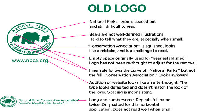
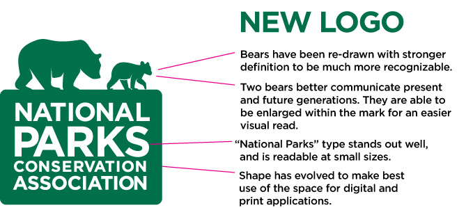
Dissection of the old and the new
The bears did receive a facelift, however. I re-drew them so that they are clearer to see when small. Two bears, instead of three, more clearly communicate our mission of “protecting our national parks for future generations,” according to focus group testing and surveys. I encouraged us to move from an oval to a rounded-corner box to make the best use of space.
It is an honor to design NPCA’s new logo, and it’s exciting to see it appear on T-shirts, postcards, reports, and, of course, our website. Thanks to everyone who has contributed feedback, creative insight, and support during this process.
About the author
-
 Annie Riker Former Creative Director
Annie Riker is the former Creative Director for NPCA. She’s currently a freelance illustrator and designer based in Asheville, NC.


